- 公開日:2022/12/31
- 最終更新日:2024/10/03
CLIENT DATA
- 顧客:
- 東進衛星予備校阪急川西能勢口駅北校
- 業種:
- 予備校
- 工事種別:
- 内装工事
- 工期:
- 約1か月
- 坪数:
- 108.00㎡(32.67坪)
- 所在地:
- 兵庫県川西市中央町8-8アメニティ川西BL3F
- TEL:
- 06-6381-0169
- 営業時間:
- ー
- 定休日:
- ー
- WEB:
- http://www.matsuogakuin.com/
THE DUPLICATED EDGE
東進衛星予備校 阪急川西能勢口駅北校
Plan
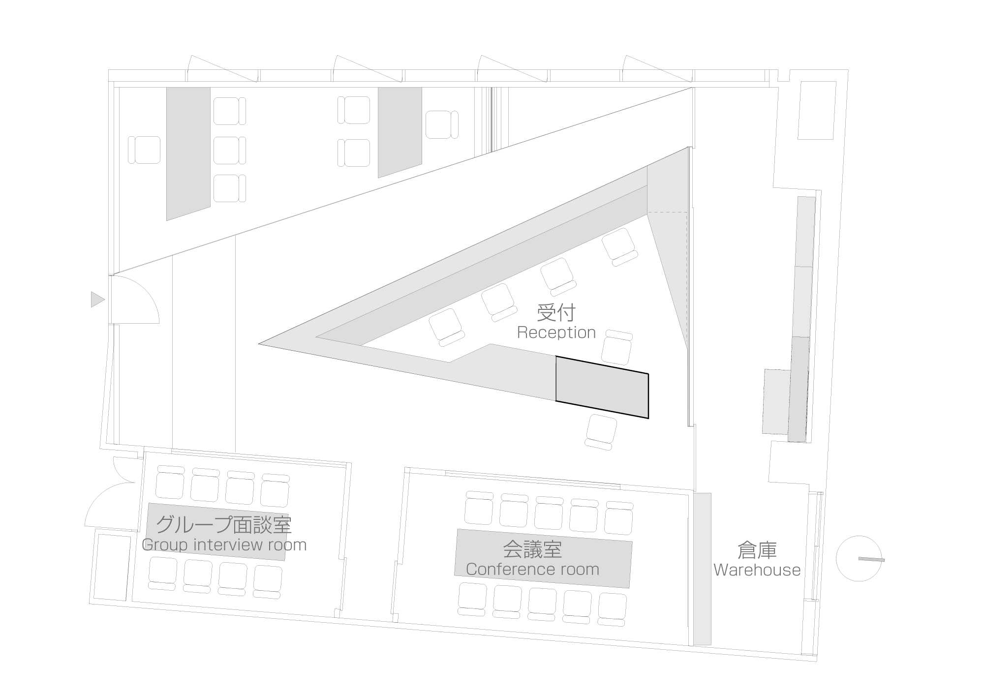
CG
Photography
Toshin Satellite Preparatory schools gained considerable place in the Japanese cram schools business despite being subject to a strong competition. This development is mostly due to the perpetual seeking of space renewal and services improvement.
For its location in Kawanishi, the school needed new reception, consultation and conference spaces in order to be more attractive and provide better accessibility to both subscribed and prospective students.
The new room available on the same floor of the mixed-use building where the classrooms are located is however relatively narrow. Dividing the space into separate functional rooms would create a non-comfortable atmosphere, creating a simple open space would result in a feeling of being crushed by the very low ceiling.
The Duplicated Edge Design offers an alternative use of the space; instead of a traditional reception desk facing the entrance and creating a deep back ground of spaces, the reception was made in a sharp-edged triangle pointing to the gate and suggesting two subdivisions of the room. On the left side the information and registration counter providing enough space to four school assistants. Across this space is a one-step elevated consultation space where two tables were placed. The narrower part of this triangular space is gradually elevated to transform into sitting space. The right side of the reception counter mutates into a low counter used for administrative documents. This side serves two meeting and conference rooms which were made in white cuboids with glazed walls facing the counter in an attention to keep the visual continuity.
The wall separating these spaces from the background is covered in mirrors extending the view to wider dimensions. The two doors at the end of each corridor were equally treated. The same logic was used to resolve the problem of the low ceiling. Instead of the mirrors, sandwiched reflective aluminum panels were used for safety reasons. These reflective panels were applied over the serving spaces letting the triangular shapes demarcating the different functions of the space.
Additionally, and in order to introduce a dynamic effect guaranteeing a smooth vertical move of the eye into the ceiling, the triangular counter was covered in a gradually ascending white metallic sheet enhancing its sharpness and linking it to the upper part. The dynamic of the space is duplicated by the reflection in the wall and ceiling generating an attractive yet functional image more adequate to a contemporary preparatory school.
Additionally, and in order to introduce a dynamic effect guaranteeing a smooth vertical move of the eye into the ceiling, the triangular counter was covered in a gradually ascending white metallic sheet enhancing its sharpness and linking it to the upper part. The dynamic of the space is duplicated by the reflection in the wall and ceiling generating an attractive yet functional image more adequate to a contemporary preparatory school.




コメントを投稿するにはログインしてください。